
How do you take a high-performing membership page on Amazon.com and make it perform even better? Looking at the data and analytics, as we as the content and hierarchy to understand how users engage with the page. From there we can provide a better experience for customers and higher returns for the business.
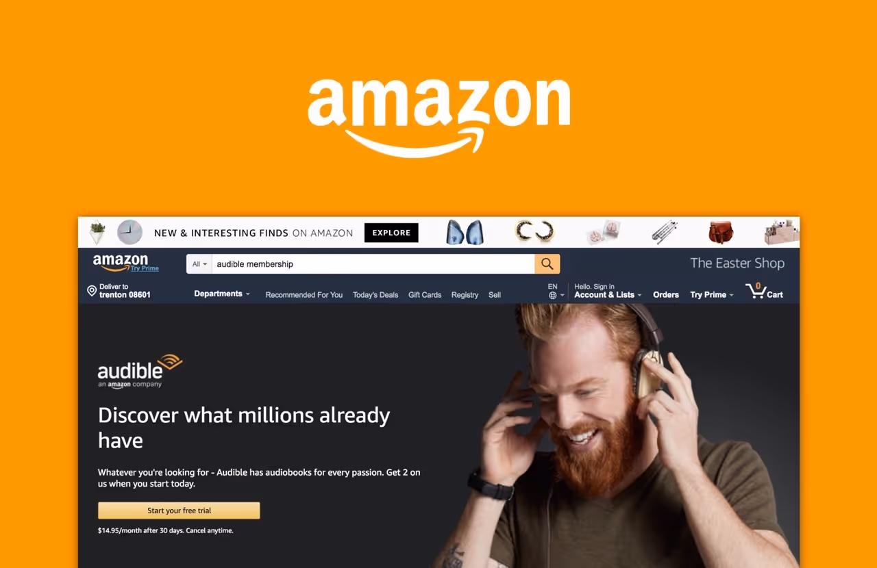
I worked on various experiences on Amazon.com for Amazon's audiobook subsidiary, Audible. Audible was gaining prominence as a wonderful service with a membership where users would get a single credit a month, good for any audiobook in their catalog of close to 200k titles. Audible had a well performing experience to describe the service and sell memberships but there were gaps in the experience which caused users not to convert to members. Addressing these gaps paid off for Amazon and Audible saw a 33% increase in paid memberships and 12% increase in trial memberships. Content was immediately digestible, users could see and sample the audiobooks, which led to a content-first trial membership, and users we able to clearly understand membership benefits. This redesign helped Audible solidify it's place in the audiobook vertical.
Looking at dwell times and depth on the membership page on Amazon, I saw that users would skip over key membership detail sections and focus on the numbered section with a 1, 2, 3 which succinctly said how to use Audible. With that user data and looking over the existing experience, we hypothesized that users were skipping over those key sections because they were heavy in copy. Users tend to skim so make the content quickly digestible. We knew this was going to be a key piece. A lot of the imagery was outdated and mentioned nothing about the content in the membership, which was a big driver for users that we ran through user testing. So we begin diving into design.


